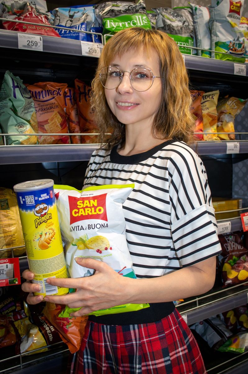
Are you the owner or one of the managers of a company that produces food, alcoholic or non-alcoholic beverages, clothing, accessories and other useful, quality goods? Then this article is a must-read (at least twice), because today we will teach you a proven way to increase profit 2-3 times with the help of the RIGHT, “selling” packaging for your product.
Mistake #1. Almost all manufacturers think that the most important thing about packaging is a “more modern” design that will attract the customer’s attention and determine their choice. 90% of our clients placing their first orders thought exactly the same. You will agree that design is merely a tool for conveying your idea to the buyer. And if there is no idea, no design will save you.
We are ready to help you find the idea and materialize it into the right, “selling” design. And so that the design, as a tool for conveying the idea, works effectively and brings you sales, the professional marketers of Pergament Printing House have compiled, especially for you, a list of must-have elements of selling packaging.
Once the idea is defined, it is time to move on to design. Here is the list of must-have elements of selling packaging:
1. Call to action
Just one word can double a product’s sales if that word is a call to action, such as: “repeat”, “open here”, “enjoy!”, “refresh yourself!” etc. Some well-known companies use a call to action as their slogan.
2. Less is more
This rule concerns the logo. Do not repeat the logo separately if it is already shown on the packaging. A repeated logo distracts from the main message, be it the USP, the product, or the brand itself. “Less is more.” That is, fewer elements ensure greater communication effectiveness.
3. Copywriting, and copywriting again…
Remember that text is not a design element. Copywriting is a powerful tool and should not be neglected. The text must be easy to read. For this you need to use an appropriate letter size, font colour and background. They must be contrasting. A line should be no longer than 5 cm.
4. Fonts
A font is one of the powerful design tools that can convey images and emotions. Fonts should be chosen not by the principle of “trendy”, “modern”, “play around with fonts”, but consciously, picturing exactly the image and idea you want to convey to the buyer. Tips for choosing a font: –UPPERCASE letters – use them to give significance to your brand –lowercase letters – use them for an approachable feel –handwritten letters – to give the image friendliness and a handmade effect –a calligraphic font will add a premium feel
5. Symbols and images
Most often, modern advertising uses images of people and animals. It is precisely images that endow your product with emotional properties and give it a certain character and individuality.
6. The shape of the packaging
A shape is effective when it is individual, memorable and can be recognized instantly. It should not be boring. Overall, the shape should be pleasant, clear about what it represents, “a joy for the eye”. And test it on children: if children are drawn to such a shape, it means you did everything right. If not – then, alas, redo it, as adults will be even less “drawn” to it.
7. Colour
One could talk endlessly about the influence of colour on the human psyche. Let’s look at the main colours used in packaging design and their meanings:
expensiveness, strictness, luxury, chic, power, mystery
passion, emotions
joy, warmth, optimism, positivity, energy
naturalness, authenticity, eco-friendliness
a feeling of cold, calm, serenity
openness, sociability
purity, lightness, minimalism
refinement
8. Rebranding, packaging redesign
“What is it for?” you will ask. For the fact that the modern world develops very quickly, which means everything becomes outdated just as fast. Therefore, for running a successful business, you need to adapt to new conditions in time, so that your brand is not boring and does not become stale.
As for rebranding a product’s packaging, there can be 2 options here:
- 1. complete rebranding, “repackaging” of the product: the same product, but in completely new, interesting or unusual packaging;
- 2. partial rebranding: adding new details to already familiar packaging that do not change but refresh the already familiar image (usually done specifically for a planned advertising campaign).
If your goal is to create the perfect packaging that will “sell itself” off the supermarket shelf, then be sure to use our recommendations. This way you will cut advertising costs, and your profit will increase 2-3 times! Tested, it works.
P.S. Developing the design of SELLING packaging is not so much a creative process as a technical one, requiring the professional skills of a designer and a marketer. It is precisely these skills that the team of professionals at Pergament Printing House possesses. Come and see for yourself.